TL;DR: Every piece of social proof rests on three things: who it’s about, which pain it names, and the outcome that customer reached. Feature a mix of four customer types, not a row of famous ones, then match the pain as closely as you can. Exact pains beat adjacent ones, and that gap decides whether a case study converts.
What actually makes a piece of social proof work?
Any piece of social proof rests on three things, whatever the format is. Who the proof is about, which pain point it names, and the outcome that customer reached. A case study, a review, a testimonial and a rating all get judged on those same three. Which is why the format is the last decision rather than the first.
Most of the work sits in the first two. The outcome is usually whatever actually happened, and you either have it or you don’t — nobody chooses it after the fact. Who you feature and which pain you name are both genuine choices, though, and that’s where the trust gets won or lost.
This isn’t about which type to reach for. If that’s the question, the six types and where each belongs is the piece underneath this one. This one, which I open at 0:40, is about what goes inside whichever type you pick and how closely it has to fit the person reading it.
Which four customers should your case studies cover?
There are four kinds, and the reason you want four is a mix rather than a run of one. Well-known customers, and customers who are expertly known. Customers who look like your buyer does right now. And customers who look like your buyer three to six months later, once they’ve made the transition.
Well-known names are the easy ones. Recognition does the work for you, and it reaches a broad audience without asking anything of the reader at all. If the customers you’re able to name aren’t famous, they should at least be expertly known. That means the companies carrying real weight inside your own industry, with the people deep enough in the domain to recognise them. Those are the names that land with somebody already deep in the domain.
The last two kinds tend to be the ones left out, and they work as a pair rather than separately. When I go to sign up for a new product I want to see somebody who looks like me. Then I want to see somebody who looks like me half a year on, having already crossed from having the problem to solving it. One tells them they’re in the right place. The other shows them where it ends up. Drop either one and there’s no journey in it.
Why do enterprise logos fail an SMB buyer?
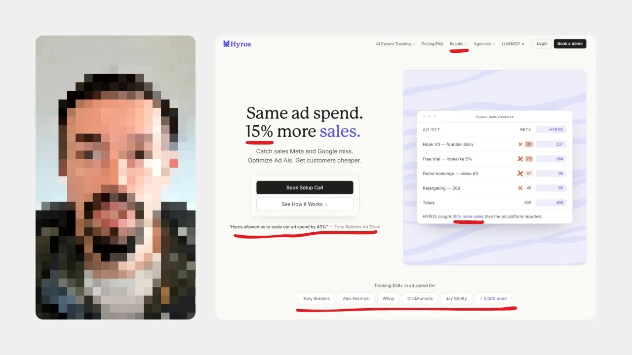
They fail because there’s nothing in them for the person you’re trying to convert right now. The failure isn’t that famous logos are bad. It’s concentration. Look at enough sites and you’ll often find one of those four groups taking up a huge share of everything on display, and it’s usually the well-known one.
People over-index there for a reason that sounds fine: big logos feel like they reach more people. You end up with a wall of enterprise brands while your go-to-market aims at mid-market or smaller. Closing those enterprise accounts is genuinely good news. Leading with them is a separate decision, and it puts real distance between the buyer you want and the customers you show.
Selling to a mom-and-pop shop and telling them you work with OpenAI builds nothing. Both of those can be real customers of yours at the same time. There’s nothing relatable between the two of them. That’s what the choice costs you.
What’s the difference between an exact pain and an adjacent one?
An exact pain is the primary thing your product changes for a customer. An adjacent pain is a real benefit of working with you that isn’t the main outcome the product produces. That distinction is the biggest lever in the whole exercise, and it’s an easy one to never consciously pull.
The most compelling proof is a set of customers who solved the exact pain and reached the exact outcome this prospect is looking for. Same problem, same destination.
If you don’t have enough of those yet and you’re assembling a library out of whatever exists, adjacent problems with directional outcomes are the fallback. They do work. The exact-versus-adjacent split at 2:13 is where I pull the two apart, because the useful part is knowing which of them you’ve actually shipped.
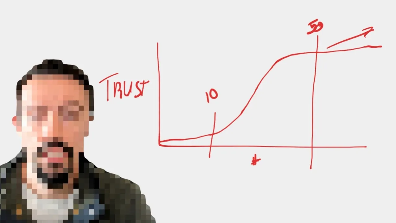
Trust then climbs on both axes at once. The closer the pain match, the more of it you build; the more varied the cast of customers, the more again. You don’t want all well-known and you don’t want all expertly known — the spread is the point, and neither axis rescues a failure on the other.
Which format belongs at which stage?
Use the most consumable social proof the reader’s stage can carry. A landing page takes ratings, logos and stats, because all three land in a glance. Your own site has room to go deeper into case studies, reviews and testimonials on top of those. A sales-led funnel finishes with references, and with case studies whose numbers aren’t necessarily public.
Underneath it is a trade between how deep a piece goes and how easily it gets taken in. It’s the same trade that decides where each of the six types belongs. Deeper content asks more of the reader, so it only works once they’re willing to give you the time. That’s why proof gets ordered shallow to deep rather than best to worst. A case study isn’t a better asset than a rating, it’s a heavier one.
Get the pairing wrong in either direction and you lose something. Show a ratings badge to somebody already deep in evaluation and you’ve told them nothing they didn’t have. And a full case study in front of a cold click asks for minutes they were never going to spend. On a landing page in particular, how much you can ask of a single click comes down to what the traffic already believed before it arrived.
| Where the reader is | What fits | Why |
|---|---|---|
| A landing page | Ratings, logos, stats | Read at a glance, nothing asked |
| Your own site | Case studies, reviews, testimonials, plus the above | There’s room to go deeper |
| After a sales call | References, case studies with numbers that aren’t necessarily public | Highest trust, narrowest reach |
When does your industry override the stage?
Whenever your buyer already expects a particular shape of social proof. Most product types have one, and that expectation outranks the stage the table above would put somebody at.
Developer products run on stats. Usage numbers, stars, adoption — that’s the currency, and stats will carry more weight there than a reference does even late in the journey. Say you land on a developer product with a self-serve motion. The first thing on the page is an invitation to go and talk to somebody about their experience. That would be a preposterous thing to present, and being late in the funnel wouldn’t rescue it.
Run an agency and case studies are pretty much the standard. Stats and logos used inside those case studies will do more than a ratings badge would. For no better reason than that it’s the format the buyer is used to reading. B2B sits in the same bucket.
A teardown: Glean’s Zapier page against Clay’s Figma page
These are two case studies from companies you’ll recognise: one works, one doesn’t. Glean’s page about Zapier gets almost everything right, and Clay’s page about Figma starts from the same raw material and loses most of it in the presentation. Clay’s hero is the better of the two, and I say so when the teardown starts at 8:22. The gap opens once you’re into the content.
The page that works puts four measurable stats in one band you take in at a glance. Probably a primary change point, plus the secondary ones that came with it. It states a before and an after, and the route between them. Several quotes sit at the bottom, each carrying a photo, a full name, a title and a company.
The weak one runs its stats through a scroller, one at a time, with no values attached to any of them. It surfaces activity instead. Contacts got enriched and updated. Great, who cares? A data layer got unified for a go-to-market motion. Again: what did that do to the revenue? That’s the question the page exists to answer.
| Element | Glean on Zapier | Clay on Figma |
|---|---|---|
| Stats | Four measurable ones, visible together | A scroller, one at a time, no values |
| What they claim | A change point, plus secondary ones | Activity: records enriched, a layer unified |
| Before and after | Stated, with the route between | Buried; you must read it all to find it |
| Quotes | Several, with photo, name, title, company | One, with a name and a department |
| Quote placement | Bottom of the page | High up, better placed than Glean’s |
| Introduction | Gets to the work | Explains what Figma is |
| Structure | Outcomes at the top | Each use case walked step by step |
Who is quoted, and can you tell they’re a customer?
Clay’s quotes have the same problem, and it costs more than it looks. There’s one, carrying a name and a general department but no specific title, and skimming past at speed you could miss that a customer is talking at all. These are B2B deals. One person speaking for an organisation of thousands isn’t a fair reflection of the work, and there should be more than a single voice in it.
Past the hero, Clay beats Glean on one more thing, and it’s worth taking: that quote sits high on the page instead of at the bottom. My own preference would be Glean’s quotes moved up directly beneath the stats, and the AI-generated summary block it opens with dropped entirely.
Clay also spends a good part of its introduction explaining that Figma makes design software, which is extraneous and shifts nobody’s opinion of Clay. It then walks each use case linearly, with a beginning and a middle and an after inside every bullet. The reader gets a run of incremental steps instead of the total change. The other page puts every outcome up top and lets the detail follow.
So what actually separated them?
The difference wasn’t the who. Both pages featured well-known customers, and Zapier and Figma are each somewhat expertly known inside their own domain, so recognition was a wash between them. The whole gap sat on the pain axis instead.
Glean’s page talked about exact pains and the exact outcomes attached to them. Clay’s talked about adjacent outcomes and directional ones. That alone made the first so much more convincing, which is the takeaway I close on at 15:29.
That gives you an audit short enough to run in an afternoon. Take the case studies you have and sort them on the two axes. How many are famous names; how many resemble the buyer you’re chasing this quarter; how many name the exact problem rather than a neighbouring one. If you want to see how I write mine up, they’re on the work page.
All of which assumes you have customers to feature at all. Starting from none, what to borrow before you have any is the piece that comes before this one.
So the rule stays narrow enough to hold in your head while you brief the next one. Exact pains beat adjacent ones, a varied cast beats a famous one, and a number the buyer cares about beats a sentence about activity. If you want a read on which piece of your social proof is doing nothing for you, tell me what you’re presenting.